| Graphics | |
Overlaying Plots on Bar Graphs
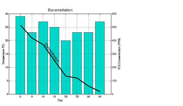
You can overlay data on a bar graph by creating another axes in the same position. This enables you to have an independent y-axis for the overlaid dataset (in contrast to the hold on statement, which uses the same axes).
For example, consider a bioremediation experiment that breaks down hazardous waste components into nontoxic materials. The trichloroethylene (TCE) concentration and temperature data from this experiment are
TCE = [515 420 370 250 135 120 60 20];
temp = [29 23 27 25 20 23 23 27];
This data was obtained from samples taken every five days during a thirty-five day period.
days = 0:5:35;
Display a bar graph and label the x- and y-axis using the statements
bar(days,temp)
xlabel('Day')
ylabel('Temperature (^{o}C)')
Overlaying a Line Plot on the Bar Graph
To overlay the concentration data on the bar graph, position a second axes at the same location as the first axes, but first save the handle of the first axes.
h1 = gca;
Create the second axes at the same location before plotting the second dataset.
h2 = axes('Position',get(h1,'Position'));
plot(days,TCE,'LineWidth',3)
To ensure that the second axes does not interfere with the first, locate the y-axis on the right side of the axes, make the background transparent, and set the second axes' x-tick marks to the empty matrix.
set(h2,'YAxisLocation','right','Color','none','XTickLabel',[])
Align the x-axis of both axes and display the grid lines on top of the bars.
set(h2,'XLim',get(h1,'XLim'),'Layer','top')
Annotating the Graph. These statements annotate the graph.
text(11,380,'Concentration','Rotation',-55,'FontSize',16)
ylabel('TCE Concentration (PPM)')
title('Bioremediation','FontSize',16)
To print the graph, set the current figure's PaperPositionMode to auto, which ensures the printed output matches the display.
set(gcf,'PaperPositionMode','auto')
| | Specifying X-Axis Data | Area Graphs | |