

| Financial Toolbox | |
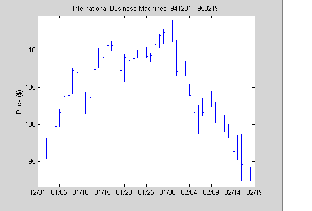
High-Low-Close Chart Example
First load the data and set up matrix dimensions. load and size are standard MATLAB functions.
load ibm.dat;
[ro, co] = size(ibm);
Open a figure window for the chart. Use the Financial Toolbox
highlow function to plot high, low, and close prices for the last 50 trading days in the data file.
figure;
highlow(ibm(ro-50:ro,2),ibm(ro-50:ro,3),ibm(ro-50:ro,4),[],'b');
Add labels and title, and set axes with standard MATLAB functions. Use the Financial Toolbox
dateaxis function to provide dates for the x-axis ticks.
xlabel('');
ylabel('Price ($)');
title('International Business Machines, 941231 - 950219');
axis([0 50 -inf inf]);
dateaxis('x',6,'31-Dec-1994')
MATLAB produces a figure similar to this. The plotted data and axes you see may differ. Viewed online, the high-low-close bars are blue.
| | Charting Financial Data | Bollinger Chart Example | |