🚀 Quick Start Guide
Get started with the LMR Seasonal Dataset in minutes
📦 Installation & Requirements
To work with the LMR Seasonal dataset, you'll need Python with the following packages:
Required Python packages:
# Install via conda (recommended)
conda install -c conda-forge xarray netcdf4 matplotlib cartopy numpy pandas

# Or via pip
pip install xarray netcdf4 matplotlib cartopy numpy pandas
💡 Tip: We recommend using
xarray for working with NetCDF files as it provides labeled multi-dimensional arrays and is specifically designed for climate data.
📚 Basic Usage
1. Loading the Data
Let's start by loading the surface air temperature data (tas_mean.nc):
import xarray as xr
import numpy as np
import matplotlib.pyplot as plt
import cartopy.crs as ccrs
import cartopy.feature as cfeature

# Load the surface air temperature data
ds = xr.open_dataset('data/mean/tas_mean.nc')

# Display basic information about the dataset
print(ds)
Expected output:
<xarray.Dataset>
Dimensions: (time: 4804, lat: 90, lon: 180)
Coordinates:
* time (time) object 0800-01-01 00:00:00 ... 2000-10-01 00:00:00
* lat (lat) int64 -89 -87 -85 -83 -81 -79 -77 ... 77 79 81 83 85 87 89
* lon (lon) int64 0 2 4 6 8 10 12 14 ... 344 346 348 350 352 354 356 358
Data variables:
tas (time, lat, lon) float64 ...
Attributes:
source: LMR Seasonal Reconstruction
Author: Zilu Meng et al, University of Washington
references: https://doi.org/10.1175/JCLI-D-25-0048.1
contact: zilumeng@uw.edu
creation_date: 2025-10-02
LMR_Homepage: https://www.atmos.uw.edu/~hakim/lmr/
2. Exploring the Data
# Check the time range
print(f"Time range: {ds.time.min().values} to {ds.time.max().values}")

# Check spatial coverage
print(f"Latitude range: {ds.lat.min().values}° to {ds.lat.max().values}°")
print(f"Longitude range: {ds.lon.min().values}° to {ds.lon.max().values}°")

# Get temperature data
tas = ds.tas

# Check temperature units and statistics
print(f"Temperature units: {tas.attrs.get('units', 'Not specified')}")
print(f"Temperature range: {tas.min().values:.2f} to {tas.max().values:.2f}")
print(f"Mean temperature: {tas.mean().values:.2f}")
Expected output:
Time range: 0800-01-01 00:00:00 to 2000-10-01 00:00:00
Latitude range: -89° to 89°
Longitude range: 0° to 358°
Temperature units: K
Temperature range: -9.11 to 6.91
Mean temperature: -0.34
Time range: 0800-01-01 00:00:00 to 2000-10-01 00:00:00
Latitude range: -89° to 89°
Longitude range: 0° to 358°
Temperature units: K
Temperature range: -9.11 to 6.91
Mean temperature: -0.34
📊 Plotting Examples
Global Temperature Map
Create a global map showing the mean temperature for the year 1850:
# Calculate the 1850CE temperature
tas_1850 = tas.sel(time=slice('1850-01-01', '1850-12-31')).mean(dim='time')

# Create a global map
fig = plt.figure(figsize=(12, 8))
ax = plt.axes(projection=ccrs.PlateCarree(central_longitude=180))

# Plot the temperature data
im = ax.contourf(ds.lon, ds.lat, tas_1850,
                 levels=20, transform=ccrs.PlateCarree(),
                 cmap='RdYlBu_r', extend='both')

# Add map features
ax.add_feature(cfeature.COASTLINE)
ax.add_feature(cfeature.BORDERS)
ax.add_feature(cfeature.OCEAN, color='lightblue', alpha=0.5)
ax.add_feature(cfeature.LAND, color='lightgray', alpha=0.5)

# Add gridlines
ax.gridlines(draw_labels=True, dms=True, x_inline=False, y_inline=False)

# Add colorbar
plt.colorbar(im, ax=ax, orientation='horizontal', pad=0.1,
             label=f'Temperature ({tas.attrs.get("units", "K")})')

plt.title('LMR Seasonal: Mean Surface Air Temperature (1850)',
          fontsize=14, pad=20)
plt.tight_layout()
plt.show()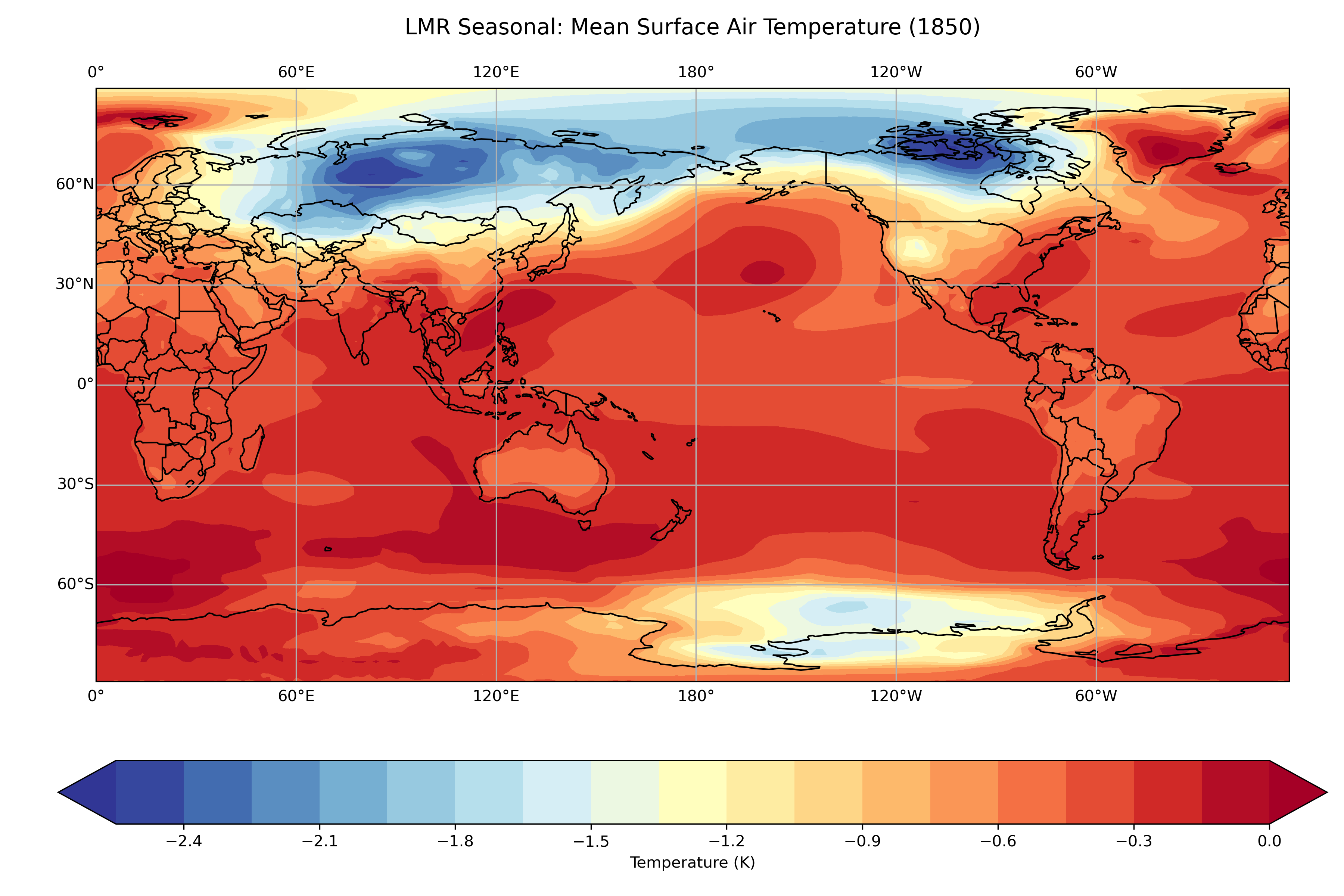
Example output: Global surface air temperature distribution for the year 1850 CE
📖 Next Steps
- Explore Ensemble Uncertainty: Load individual ensemble members from
data/members/to analyze reconstruction uncertainty - Compare with Observations: Validate the reconstruction against instrumental data for the modern period
- Climate Index Analysis: Use the pre-computed climate indices for large-scale climate pattern analysis
- Advanced Visualization: Create publication-quality figures using additional matplotlib and cartopy features
📚 Additional Resources:
• Xarray Documentation
• Matplotlib Gallery
• Cartopy Documentation
• LMR Seasonal Dataset Homepage
• Xarray Documentation
• Matplotlib Gallery
• Cartopy Documentation
• LMR Seasonal Dataset Homepage